Regression to the mean (RTM) can be difficult to understand. Oftentimes, this concept is explained in the context of trying to interpret data involving repeated measurements, such as data that have been collected through time. However, RTM is applicable to tons of scenarios: anytime you have two variables that are imperfectly correlated!
classic example
RTM implies that if you observe an extreme result, the next time you record data, you are more likely to observe results that are closer to the mean value. For example, assume someone’s performance at a task is not the same every day but has random variability that depends on sleep, mood, weather, and other random events that happened that day. Most of the time their performance is near its average value, but some days are just really bad (or good!).
RTM implies that if this person performs very poorly on day 1, their performance on day 2 is more likely to be towards its mean value just because of a statistical tendency. That is, this person’s performance is expected to increase from day 1 to day 2 simply due to RTM. Without knowing about RTM, we could easily come up with some plausible but incorrect explanations as to why this increase occurred (e.g. say someone yelled at them for performing poorly, so they were ‘motivated’ to do better the next day), but this observation is completely consistent with random fluctuations in performance each day.
inuitive definition with visualizations
Another definition of this concept, along with the visualizations below, really helped this concept click for me: whenever the correlation between two variables (e.g. performance on day 1 vs day 2) is less than one, there could be be RTM. That is, if one variable doesn’t perfectly predict another (e.g. when x is 10, y is close to 10 but not exactly), which is almost always the case, then RTM is a mathematical inevitability.
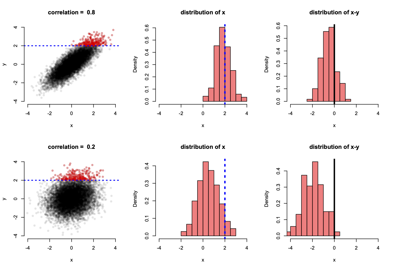
To visualize this, let’s look at two normally-distributed variables, x and y, that are imperfectly correlated with either a high or low correlation of 0.8 or 0.2, respectively (Figure below). To visualize RTM, let’s select extreme values of y and look at the conditional sampling distribution of x, given y. This is analagous to the situation above where we condition on observing an extreme performance on day 1 and then peek at what the distribution of day 2 looks like.
These two variables are plotted below in two scenarios in which they have a high (top row) or low (bottom row) correlation. The sampling distribution of x, conditional on y being extreme (greater than 2), is highlighted with the red dots in the scatterplots (left column) but also shown explicitly with histograms (middle column). Moreover, RTM may be directly analyzed for these values when y is extreme by looking at the distribution of x - y, for which negative values indicate x is less than y.
For the case where x and y are highly correlated, x takes on similar values as y, greater than 2, only about half the time (top middle plot), whereas the other half of these x values are less than 2. Consequently, there is a slight bias towards x generally taking on smaller values than y (top right plot), indicating RTM (here values of 0 indicate no RTM). The effect is a bit subtle here, but if we do the same exercise when x and y have a lower correlation (bottom row), there is strong RTM as a vast majority of the values x might take on are less than 2 (bottom middle plot) and almost always less than their corresponding y value (bottom right plot). Here, x almost always regresses to its mean.
I could list some examples here, but there are so many. If you think of two imperfectly correlated variables, you could potentially observe RTM!
Below is the R code used to generate this figure:
Loading in libraries. I will use ‘mvtnorm’ to simulate two noramlly-distributed variables that are imperfectly correlated.
library(mvtnorm)
library(scales)
library(tidyverse)
## ── Attaching packages ────────────────────────────────────────────────────────────────────────────── tidyverse 1.3.0 ──## ✓ ggplot2 3.3.2 ✓ purrr 0.3.4
## ✓ tibble 3.0.3 ✓ dplyr 1.0.0
## ✓ tidyr 1.1.0 ✓ stringr 1.4.0
## ✓ readr 1.3.1 ✓ forcats 0.5.0## ── Conflicts ───────────────────────────────────────────────────────────────────────────────── tidyverse_conflicts() ──
## x readr::col_factor() masks scales::col_factor()
## x purrr::discard() masks scales::discard()
## x dplyr::filter() masks stats::filter()
## x dplyr::lag() masks stats::lag()Let’s make our two variables have a high correlation of 0.8 and then a low correlation of 0.2 and look at the difference. We will store these values in a vector that we will iterate across.
covars <- c(0.8, 0.2)For each of these covariances, or correlations between the two variables, we will simulate data and make a plot.
par(bty="n", mfrow=c(2,3)) # make a plot with no box type with 6 panels: 3 rows and 2 columns
for (covar in covars){

  covar_mat <- rbind(c(1,covar), c(covar,1))    # create covariance matrix

  # create table of draws from a bivariate normal distribution
  d <- rmvnorm(n=10000, mean = rep(0,2), sigma=covar_mat) %>%
    as_tibble() %>% rename("x" = V1, "y" = V2)

  # create another table that selects only extreme values for y
  d_red <- d %>%
    filter(y >= 2)

  # make a plot
  plot(d$x, d$y,
     pch=16,
     col=alpha("black", 0.1),
     main=paste("correlation = ", covar, sep=" "),
     xlab="x",
     ylab="y",
     axes=F,
     ylim=c(-4, 4),
     xlim=c(-4, 4))
  points(d_red$x,
    d_red$y,
    col=alpha("red", 0.3),
    pch=16)
  axis(side=1,  labels=T, at=c(-4,-2,0,2,4))
  axis(side=2, labels=T, at=c(-4,-2,0,2,4))
  abline(h=2, lty=3, col="blue", lwd=2)

  hist(d_red$x,
       col=alpha("red", 0.5),
       xlab="x",
       freq=F,
       main="distribution of x",
       breaks=10,
       xlim=c(-4, 4))
  abline(v=2, lty=3, col="blue", lwd=3)
  hist(d_red$x - d_red$y,
       col=alpha("red", 0.5),
       xlab="x",
       freq=F,
       main="distribution of x-y",
       breaks=10,
       xlim=c(-4, 4))
  abline(v=0, lty=1, col="black", lwd=3)
}